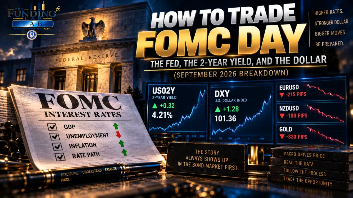
How to Trade FOMC Day: Fed, 2-Year Yield & Dollar
How to Trade FOMC Day: The Fed, the 2-Year Yield, and the Dollar (September 2026 Breakdown)
Today the dollar exploded. And I was on the right side of it.
Coming into the September 2026 FOMC, I was short EUR/USD, short NZD/USD, and short gold. When the Fed's projections hit and the DXY ripped higher, those positions paid, and paid well. That's my personal result from today, not a promise that the same trades print every time. So before you screenshot a green DXY candle and go buy the dollar with both hands, let me tell you the actual lesson from today, because it isn't the candle.
The lesson is learning to SEE the repricing before you react to it. Any amateur can look at a green candle after the fact and say "the dollar went up." A professional understands WHY capital repriced the dollar, watches the bond market confirm it, and lets price tell him whether the market actually agreed. That's the difference between gambling on news and reading the story.
So let me walk you through exactly how I read an FOMC day, using today as the case study. This is the framework I teach, and once you have it, Fed days stop being scary coin flips and start being some of the cleanest setups on the calendar.
Key Takeaways
The dot plot shows where policymakers think rates should GO, not what they did today. Markets trade that expectation.
Read any SEP fast with four numbers: GDP, unemployment, inflation, and the median fed-funds path, each versus the last SEP.
September 2026 read: growth up, unemployment down, inflation slightly hotter, and a rate path substantially higher than June. Higher for longer.
Don't just watch DXY. Watch the 2-year Treasury yield (US02Y) to confirm the market is repricing rates.
The real question isn't "was the Fed hawkish?" It's "was the Fed more hawkish than the market already priced?"
The chain that matters: Fed data leads to the 2-year yield leads to the dollar leads to your pairs.
First, What the SEP and the Dot Plot Actually Are
Before we trade anything, you have to know what you're reading. The Summary of Economic Projections, the SEP, is put out by Fed board members and Reserve Bank presidents. Each participant submits their own projections for growth, unemployment, inflation, and the interest-rate path they personally think would be appropriate given their outlook.
Two things you must burn into your brain.
One: these are projections, not promises. They reflect what each participant believes would be appropriate policy given their forecast. If conditions change, those views change.
Two: the famous dot plot is not a record of what the Fed did today. The FOMC statement tells you whether they held, hiked, or cut the current target range. The dot plot tells you something different and, for us, more valuable. It tells you where policymakers currently believe rates should head in the future. And since markets trade expectations, a shift in that projected path can move everything.
The 4-Number SEP Cheat Sheet
You do not need to digest 200 lines of an SEP at 2:00 PM. Start with four numbers, each compared to the previous SEP. Higher or lower?
GDP growth
Unemployment
Inflation
Median fed-funds rate path
That's it. Those four, read against the last projection, tell you the story in about fifteen seconds. Here's what today's September read looked like against June:
GDP: UP
Unemployment: DOWN
Inflation: UP
Projected fed-funds path: UP, and not by a little
Four arrows, and you already know the direction of the day before you read another word.
What the September 2026 SEP Actually Showed
Let me put a little meat on those four arrows, because the details are where the conviction comes from.
Growth got stronger. Participants nudged 2026 real GDP from 2.2% up to 2.3%, and 2027 from 2.3% to 2.4%. Small numbers, but the direction is the message. The Fed is not projecting that high rates break the economy. If growth were falling apart, they'd have a reason to cut fast. They don't see that.
The labor market improved a lot. The 2026 unemployment projection dropped from 4.3% to 4.1%, with 2027 and 2028 also revised down to 4.1%. Even bigger: in June, 7 participants saw unemployment risks tilted to the upside. In September, ZERO did, with 17 of 18 calling those risks broadly balanced. In plain terms, the Fed has far less reason to rush in and rescue the job market than it appeared to three months ago.
Inflation got slightly hotter, not cooler. Headline PCE for 2026 ticked from 3.6% to 3.7%, and core PCE from 3.3% to 3.4%, both still well above the Fed's 2% goal. And 17 of 18 participants saw inflation risks tilted to the upside. They aren't just forecasting elevated inflation. They think the risk is that it runs even hotter than their baseline.
The projected rate path moved substantially higher. This is the centerpiece for currency traders. Here's the median projected fed-funds rate, June versus September:
Year | June 2026 | September 2026 | Change |
|---|---|---|---|
2026 | 3.8% | 4.1% | +0.3 |
2027 | 3.6% | 4.1% | +0.5 |
2028 | 3.4% | 3.9% | +0.5 |
Longer run | 3.1% | 3.2% | +0.1 |
The 2027 and 2028 medians each jumped roughly half a percent. The dots didn't drift, they migrated up as a group. That's policymakers collectively deciding the appropriate path is meaningfully higher than they thought in June.
The Whole SEP in One Sentence
If you remember nothing else, remember this:
Stronger economy, plus stronger labor market, plus sticky inflation, equals a higher-for-longer rate path.
A stronger economy with hotter inflation is not an economy that needs the Fed to cut in a hurry. That's an economy where the Fed can keep policy restrictive and justify it. That single idea drove everything that happened in the markets next.
Why This Moves Treasuries
Here's the bond lesson, and it's the bridge to the whole trade.
Bond prices and yields move in opposite directions. When prices fall, yields rise. When prices rise, yields fall. Nothing in the SEP literally says "Treasury prices will fall." That's not what the document does. But the setup creates real upward pressure on yields, especially at the front of the curve.
The logic is clean. If the market believes the Fed will hold rates higher for longer, investors demand higher yields on short-term Treasuries. For existing bonds to stay competitive, their prices have to drop. Higher expected Fed path leads to higher required short-term yields, which leads to lower existing Treasury prices. The hotter inflation forecast reinforces it, and the stronger growth and jobs picture reduces the need for the Fed to ease. Every arrow points the same way.
Why the 2-Year Yield Is Your Confirmation
For this framework, the 2-year Treasury yield is the number to watch, because it's the most sensitive to Fed policy expectations over the next few years. On TradingView you're watching US02Y.
One thing traders constantly mix up: US02Y is the YIELD, not the price. So US02Y going up generally means the 2-year Treasury price is going down, and vice versa.
Here's why this matters on Fed day. Say the projections look hawkish and your gut screams "buy the dollar." Slow down. That skips the most important step. The real question is whether the Fed just told the market something MORE hawkish than the market had already priced in. Markets move on surprises and repricing, not on whether a number simply looks high.
That's where the 2-year earns its keep. If the SEP drops and US02Y shoots higher, the bond market is telling you out loud: "we need to price a higher path for short-term U.S. rates." That's your confirmation that the market is reading the data in the same direction the higher dot plot implied. No confirmation, no conviction.
From Bonds to the Dollar
Now connect bonds to currency, because that's where we actually trade.
The transmission runs like this. The Fed is expected to stay tighter, so expected U.S. rates rise relative to other countries. Short-term Treasury yields rise. Dollar assets get more attractive and rate differentials shift toward the dollar. Demand for dollars increases. DXY rises.
This isn't a mechanical law. Currencies also price global risk sentiment, foreign central banks, growth differentials, and positioning. But around an FOMC repricing, this relationship is one of the most reliable reads you'll get. So the confirmation framework is simple:
US02Y up plus DXY up equals a clean confirmation of an upward U.S.-rate repricing.
US02Y down plus DXY down equals a clean confirmation of a downward repricing.
If they diverge, don't force it. Investigate.
Today, US02Y and DXY confirmed each other to the upside. The bond market and the currency market agreed. That agreement is what gave me the confidence to hold my shorts.
How I Traded It Today
So let me show you the trades, and understand these are my personal results, not a guarantee the same setups repeat.
I was short EUR/USD, short NZD/USD, and short gold going in, and the dollar surge worked in my favor across all three. The reasoning behind them was one connected thesis, not three random bets.
With EUR/USD, the dollar is the quote currency, so all else equal, a big dollar move up pushes EUR/USD down. Same story with NZD/USD, dollar is the quote, so a stronger dollar drags it lower. Gold is more nuanced, but gold is priced in dollars and is sensitive to real yields, nominal yields, and policy expectations. When the dollar and U.S. yields both surge at once, that's a rough environment for gold. So one thesis, dollar strength on a tighter U.S. rate outlook, pointed all three the same way.
And here's the part that matters. Those trades were not built on seeing a green DXY candle. They were built on understanding WHY the dollar was repricing before the candle ever finished printing. Risk management is KING. If you can't manage risk, you're COOKED, and I only pressed those positions because the driver, the bonds, and the dollar were all telling the same story.
The Two Questions That Separate Pros From Reactors
This might be the most sophisticated lesson of the whole day, so read it twice.
There are two different questions.
Question one: was today's Fed communication hawkish or dovish compared to the last SEP? Versus June, the projected path clearly moved higher. So, hawkish on that measure.
Question two, and this is the one amateurs skip: was it more hawkish or dovish than the market expected right before 2:00 PM? Those are not the same thing. If traders had already priced an even higher dot plot, the Fed could print a higher path and the dollar could still FALL, because the news wasn't as hawkish as what was already baked in.
That's why you don't trade the document. You trade the reaction. The market itself tells you whether the new information caused a real repricing. Which is exactly why the framework is Fed data, then US02Y, then DXY, and never Fed data straight into a blind entry.
What to Listen For From the Fed Chair
After the SEP comes the press conference, and your job is to hear whether Fed Chair Powell reinforces or pushes back on the message in the projections.
Lean hawkish if you hear that inflation remains persistent, upside inflation risks remain, there's no urgency to cut, restrictive policy needs to stay, or the economy remains resilient. Lean dovish if you hear that inflation is moving sustainably toward 2%, employment risks are rising, the labor market is softening, or the degree of restraint can come down.
But do not trade one isolated sentence. A single line can sound hawkish while the market reads the whole press conference as dovish, or the reverse. So keep your eyes on US02Y and DXY while the Chair talks, and let the market referee the tone for you.
The Real Lesson
Here's the line I want you to tattoo on your trading brain from today:
I didn't need to predict Powell. I needed to understand what changed, watch the bond market confirm it, and let the dollar tell me whether the market agreed.
That's the whole game on a Fed day. The chain goes: economic projections change, Fed policy expectations change, bond traders reprice Treasuries, yields move, rate differentials shift, currencies respond, DXY moves, and your pairs follow. When you can read that chain, you graduate from "the news was bullish so the dollar went up" to "I understand why capital repriced the dollar." One of those traders gets faked out constantly. The other gets paid.
So don't just watch DXY. Understand what is moving DXY. On an FOMC day, the best place to find that answer is the front end of the Treasury curve, especially the 2-year yield. That turns US02Y and DXY from two random charts into one macroeconomic story.
Where You Learn to Read the Whole Chain
Reading a Fed day like this, connecting the driver to the bonds to the dollar to your pairs, is exactly the skill that separates funded traders from people who react to candles. It's not something you can pick up from a green screenshot. It's a way of seeing the market that has to be built.
That's the work we do inside The Funding Lab.
Inside The Funding Lab, EFXU traders learn to read the real economic drivers behind the markets, connect them to price through structure, liquidity, and rate expectations, and build setups around WHY capital is actually moving, not just what a candle did after the fact. It's taught live, in a room where getting funded and staying funded is the normal expectation, for $149 a month. That's where you stop reacting to the news and start reading the story before it finishes.
Stop trading the candle. Come learn to read the chain.
Join us inside The Funding Lab at thefundinglab.io.
Frequently Asked Questions
What is the Fed dot plot and the SEP? The Summary of Economic Projections (SEP) is a set of forecasts from Fed officials for growth, unemployment, inflation, and the appropriate interest-rate path. The dot plot is the part where each official marks where they think the fed-funds rate should be at year-end. They're projections of appropriate policy, not promises of what the Fed will do.
How do you quickly read an SEP on FOMC day? Start with four numbers versus the previous SEP: GDP, unemployment, inflation, and the median fed-funds path. Note whether each is higher or lower. That gives you the direction of the story in seconds. Then check the market reaction in the 2-year yield and the dollar before acting.
Why watch the 2-year Treasury yield (US02Y) on Fed day? The 2-year yield is the most sensitive to Fed policy expectations, so it's the fastest confirmation of whether the bond market is actually repricing rates. Remember US02Y is the yield, not the price, so a rising US02Y generally means the 2-year bond price is falling.
Does a hawkish Fed always mean the dollar goes up? No. What moves the dollar is whether the Fed was more hawkish than the market had already priced. If traders expected an even more aggressive stance, a hawkish-looking release can still send the dollar lower. That's why you confirm with the market reaction instead of trading the document blindly.
What does "higher for longer" mean for forex traders? It means the market expects the Fed to keep rates elevated rather than cutting soon, which tends to support short-term U.S. yields and can strengthen the dollar relative to currencies whose central banks are easing. That dynamic pressures pairs where the dollar is the quote currency and can weigh on dollar-denominated assets like gold.
How should a beginner approach trading an FOMC announcement? Cautiously, and with a framework rather than a reaction. Understand the SEP's four key numbers, watch the 2-year yield and the dollar confirm the repricing, and never risk more than you can afford on the volatility. Many traders are better off waiting for the initial chaos to settle and trading the confirmed move.
Coach MJ Worthmore is the founder of Elite Forex University (EFXU). This article is for educational purposes only and is not financial advice. Federal Reserve projections are forecasts of appropriate policy, not promises of future action, and the figures cited reflect the September 2026 SEP as reported at the time of writing. Any trades described are the author's personal results and are not typical, not a recommendation, and not a guarantee of your own results. Trading forex around high-impact news involves substantial risk. Always do your own due diligence.